We must also keep in mind that the way we use a font is important. For this reason, aspects such as size, the clarity with which the characters are displayed, the height standards and the contrast ratio should be taken into account in order to improve the degree of readability.
When using Google Docs we must know that the tool has thousands of fonts from which to choose. All of them are safe to use and can be easily downloaded from their website. In addition, all fonts are open source and free so there is no license restriction. In this way we can use them in our documents, websites or on paper.
Must-have fonts for Docs
Next, we are going to see different types of essential letters that should not be missing when having them available when working and creating documents with Google Docs, thus giving a better touch of professionalism and legibility to our writings.
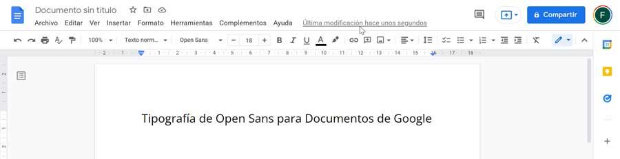
Open Sans, ideal for formal cards
It’s about a highly readable typeface eEspecially indicated to be used for academic requirements such as research, reaction or other types of tasks. It is also interesting to write data on a spreadsheet or to write formal letters. This type of font can be recognized because it is usually common on websites since it is very readable even on small screens. In addition, it is clean and has a clear, balanced and modern appearance. Since its appearance resembles that of a human being holding a pen with minimalist strokes, it is used mainly in education, finance and the government sector.
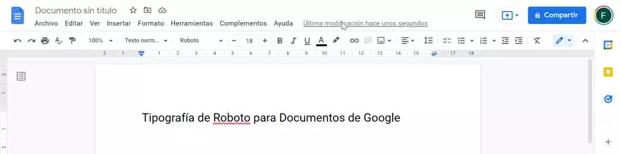
Roboto, to view documents on mobile
We are talking about a font developed by Google that stands out for its condensed appearance. That is why it is perfect to use it in documents that want us to have a lot of content, but we do not have much space to work. This typeface has a geometric style, with open curves, causing it to become a versatile typeface for general use in any activity. Along with it you can use other types of fonts from the same family such as Roboto Condensed and Roboto Slab. As a curiosity, it must be said that we are facing the font that uses the Android operating system. Therefore, we must consider its use if our document is going to be opened on a tablet or mobile. Also in documents where the content has to be condensed on a page.
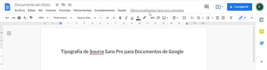
Source Sans Pro, sleek and slim
It is a typeface that belongs to the Adobe open source typeface family. It is considered the best option for user interfaces. Given its simplicity, elegance and slenderness, it is very pleasant to see. Likewise, it is very recognizable at first glance due to its having a very minimalist approach. It also looks pretty good when we need to make a paragraph heading and blends seamlessly with other types we’ve seen before like Roboto and Open Sans. This makes it interesting to pair them in our writings for a change. This typeface has its main use in writing articles or blog, as well as for taking notes or keeping a journal.
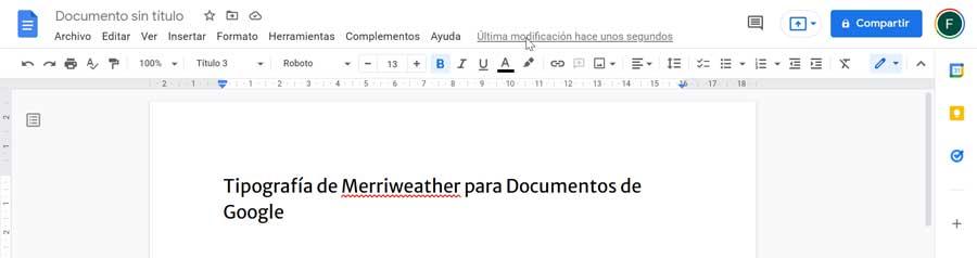
Merriweather, for polished and elegant writing
We talk about another of the main sources and essential of Google. It has a complete set of weights and styles available in Docs, as well as a more than interesting set of glyphs. For many it can be considered a strange font, not in vain its style is very characteristic and differential, balancing both aesthetics, expression and utility. That is why, when using it, we can obtain briefs that emit a polished and elegant appearance, making them have a more professional appearance. Despite its unique style, it also blends seamlessly with other fonts such as Roboto and Montserrat. It is used mainly for paragraph headings and writing professional letters or documents.
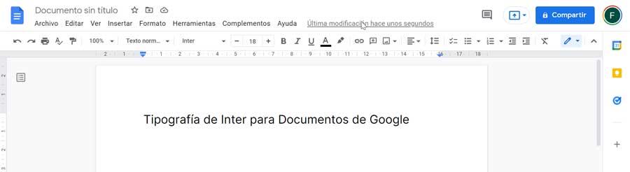
Inter, improves readability in lowercase
We are talking about a typeface that has been specially designed to work specifically in 11px sizes. This is so given that it has a height that allows us a better readability of lowercase texts, standing out especially if the readability of our document is a priority for us. In total we find nine different styles within the inter UI family. If we are passionate about texts with a very careful and friendly spacing while being formal, it is one of the best options we can use when writing. Its main use can be found in the writing of personal documents and blog posts or articles.
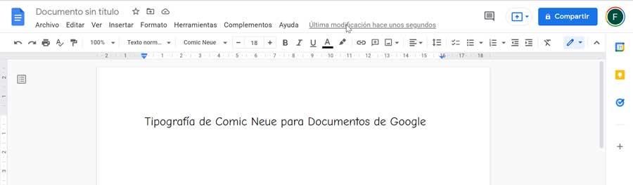
Comic Neue, the sophisticated brother of Comic Sans
Possibly we know one of the most popular fonts such as Comic Sans. In this case we must say that Comic Neue is its sophisticated brother that we can find within Google Fonts. This typeface offers a molding to the squashed, crooked, and weird glyphs of Comic Sans as well as keep that touch of fun so much has characterized this typeface. With a more childish feel and look, Comic Neue works very well for a young audience who also wants practical benefits. Despite not being used especially within the professional field, it is considered a more legible typeface for readers dyslexic.
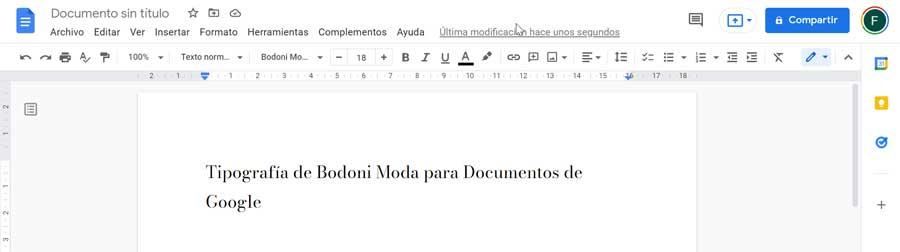
Bodoni Moda, a timeless classic
We are talking on this occasion of a font designed for the first time at the end of the 18th century, so we are above all a timeless classic. It stands out for its sharp edges and straight lines that give it a attractive yet modern look. Given its contrasts for the thin and thick strokes, this typeface has been used everywhere. More commonly we can find it in headlines and in display in luxury magazine printing where it highlights the sharp details of fine lines. Furthermore, in Europe it is also used more frequently within the body of the text.
How to add them to Google Docs
As we have mentioned, Google Docs is an online word processor. This makes it possible to access it from our browser and it supports the addition of all available fonts. To be able to use it, you only need to have a Google account and directly access the Documents section to start working.
Adding any typeface is very simple, since Google has compatibility with thousands of them. It will only be necessary to create a new blank document to later click on the drop-down button of “Source”. This will open a list with a large number available so we can select any of those that are installed by default depending on our needs.
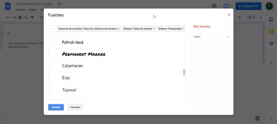
We can also add any other by clicking on «More sources». Then a new window opens showing all the available ones. They can be filtered by writing system types and sorted by alphabetical order, popularity, trends, etc. We just have to select the one we want and click OK. In this way it will be added and we can use them in our document.