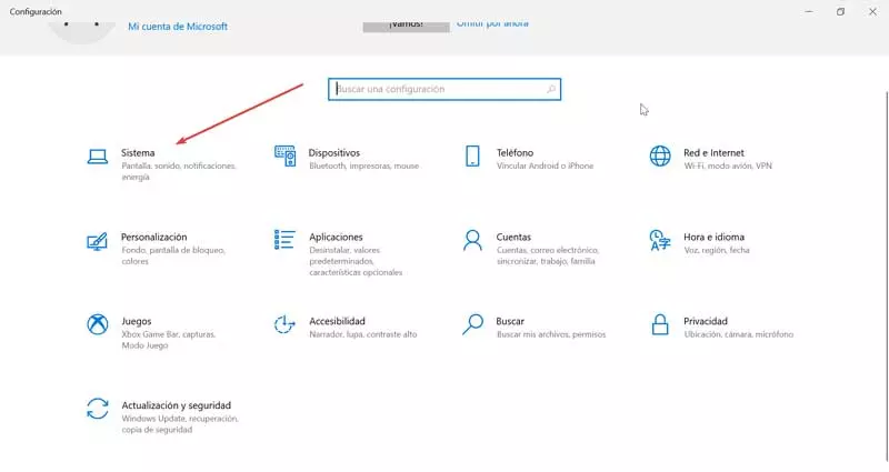
With more than a year on the market, Windows 11 is gradually gaining a foothold in the market, a market that is still dominated by Windows 10 with more than 70% share. This new version of Windows, highly criticized by some users due to the high requirements, meant an aesthetic renewal of the taskbar, a taskbar that is located in the central part, a change motivated, as we have explained previously, by the format of the current monitors (16:9) to avoid having to turn the head / eyes every time we want to access the start menu.
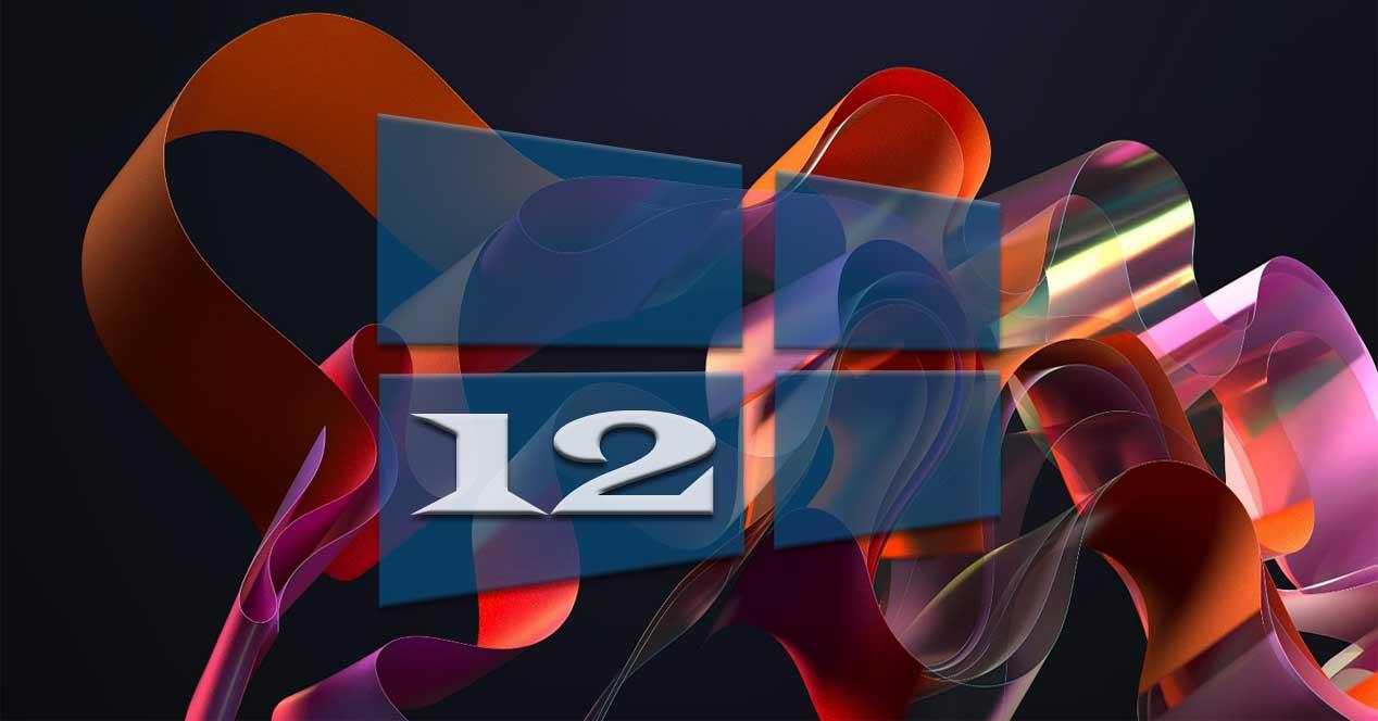
In addition to the icons on the taskbar, the rest of the aesthetic section is practically the same, so it is not necessary to go back to learn to use windows from zero. Despite having only been on the market for a year, some designers are already making concepts of what the next version of Windows could be like, number 12, a design that could mean a complete change in the design and operation of Windows if it were taken finished.
As we can see in this concept based on how its creator would like Windows 12 to be, if it is carried out, the widgets and notifications would be displayed in the lower left part of the taskbar, a taskbar that would be separated from other elements, just like in macOS, along with playback controls and widget information randomly. In the lower right part of the screen, the volume controls would be displayed along with the devices that will be connected to the computer, as well as access to the Windows control center to modify the volume, brightness, connections, and display modes.
But, what is most striking would be the operation of the desktop, a dynamic desktop that, using the wallpapers that would come with this new version, would open to give access to the widgets, instead of being displayed on the right side of the screen when we place the mouse over it. In addition, this would also adapt to the widgets that we place on the desktop, scrolling background elements to fit your position. The idea is not bad, but it would force users to use a certain type of wallpaper if they want to use this functionality.
The file explorer would also receive a functionality available in macOS and that allows you to set colored labels depending on the content of the file so that, when searching, we can quickly filter the results using tags and the possibility of creating collections without the need to create folders. This concept also shows us a new concept of multitasking that would allow us to move the two or more applications that we have open across the desktop to open new ones.
When introducing changes to the user interface, Microsoft is not based on how it would look aesthetically, but rather seeks a reason or reason to carry it out, such as changing the position of the taskbar icons in Windows 11. Is this design likely to come to Windows 12? Time will tell but it is still too early to speculate about its possible design.