When we use the web browser, we are generally used to typing a URL in it, or directly making a query in the search engine, and waiting for the results. But do we really know everything that goes on underneath when we do this?
The Chrome Developer Console
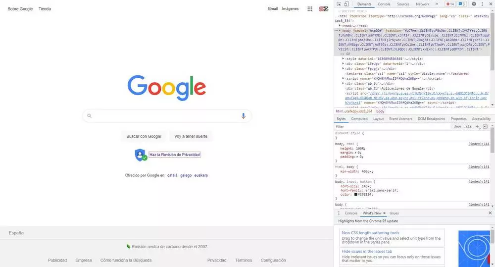
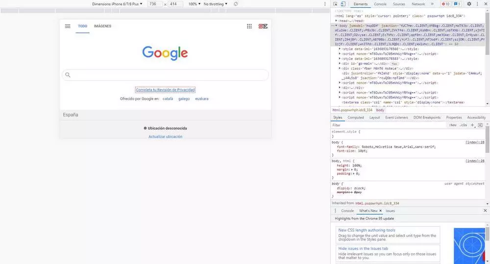
All web browsers, especially Chrome, have all kinds of functions and tools for all users. One of them is the development console. As its name suggests, this is a console designed so that web designers can see how their website works, know in detail everything that happens on the frontend, and test different changes and adjustments on the page “on the fly”.
We can open this console at any time by simply pressing the F12 key of our keyboard. We can also open this console by right-clicking anywhere on a page and choosing the option «To inspect«, Or with the keyboard shortcut Control + Shift + I. This will open (by default, although we can change it) in the right part of the window, and from there we will be able to see a large number of options.
We will can see the full HTML of the page that we have open, all the elements that form it, each and every one of the connections that are made with the server, the performance of the page, the memory it consumes … Absolutely everything that is related to the web.
We can add elements to code, modify any point of the page, eliminate content that does not interest us, see errors, detect possible bottlenecks or problems that may negatively affect the SEO of the web … the possibilities are endless. We can even inject code directly into the page from your console to see how it responds.
Of course, we must bear in mind that the changes we make from this console are local. We are not hacking the website in question, nor are we saving any changes. To reload the page again, we simply have to press F5 to update it, and it will return to its original state. (freebasstranscriptions.com)
To close the console we can use the F12 key again, or simply click on the close button that we find in the upper right part of this development console.
Change the display type of a website
One of the most interesting tools that we can find within this development console is the possibility of changing the type of device that simulates the loading of the page. By default, Chrome will use the properties of our PC (that is, indicate to the server that we are a computer and, depending on the resolution and aspect ratio of the screen will display the appropriate page) to display the page. But, if the web is responsive, this can change.
To do this, what we will do is open the development tools that we have just seen in the previous point, and we will look at a small icon that appears in the upper left part of that section.
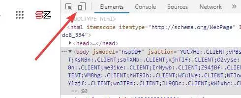
This icon will allow us to quickly change the type of view of the web browser. As soon as we click on it we can see how resize the page, and the way they load the elements. If it doesn’t, we may have to press F5 to reload.
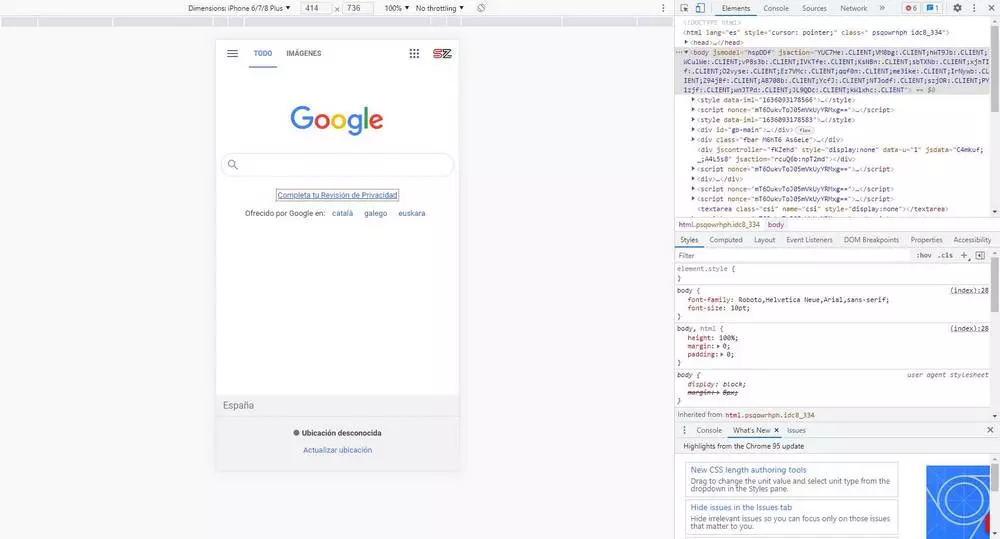
At the top we can see a bar from which we can change various aspects of this mobile view. For example, we can simulate what the web would look like on a specific device, or adjust zoom levels. We can also manually specify the dimensions of the screen, in pixels, if none of the options that come by default adapt to what we are looking for.

A very interesting button that we can also find is the one that allows us to rotate the computer screen. So we can see how the web would look when users play it in landscape mode.
When we have already carried out the tests we want, we can simply exit this mode by closing the developer console. Again, we may need to refresh the page for it to display correctly again.
Extensions for Chrome
In addition to using the developer console, we will also be able to do the same using some extensions that we can find completely free in the Chrome Store. Some of the best are as follows:
Mobile View Switcher
This extension allows us to switch between the normal view and the mobile view with one click. When installing it, it creates an icon in the toolbar, which acts as a switch depending on whether we want to have it activated or deactivated. By default it simulates an iOS 14 system, but we can modify it and adjust the extension to our liking.

Responsive Viewer
Another very useful tool for developers to check how well their responsive websites are working. This allows us to see several screens, of different sizes, at the same time. In this way we can have several configurations in view and check that everything looks correctly and does not give problems in any type of device.
Mobile simulator for Chrome
This tool allows us to simulate a large number of real devices (5 Android models, 15 Apple, 4 tablets and 4 special devices) to be able to see how the pages appear depending on the CSS that is being requested according to the size of the screen each.
Responsive Web Design Tester
Finally, this extension, although less known, allows us to thoroughly test how responsive views of a website work based on several different parameters. It allows us to test with various mobiles, including by default the most common resolutions and proportions. In addition, this extension sends the appropriate User-Agent to the server so that the results are more accurate. It even works offline, something not all extensions do.