Practically since the beginning of the year 2022, everyone was clear that we would have a new street-fighter on stage. And the reason must be found in the usual cycle of this type of games but, above all, in the arrival of the next-gen and the celebration of the 35th anniversary of the franchise within a panorama where the eSports scene rules a lot, which, with each passing year, is gaining more and more importance within the saga.
At the moment a teaser and a logo
Capcom released on February 21 the first teaser trailer for Street Fighter 6 with what looks like the beginning of a fight between the famous Ruy, who never misses one of these events, and Luke. The two pretend to fight with a demonstration of blows that shows more or less what that graphic evolution that fans expect for the new saga will be like. Essentially, hyper realistic movements and a smoothness that hopefully resembles that of the trailer itself, which makes for a truly amazing impression.
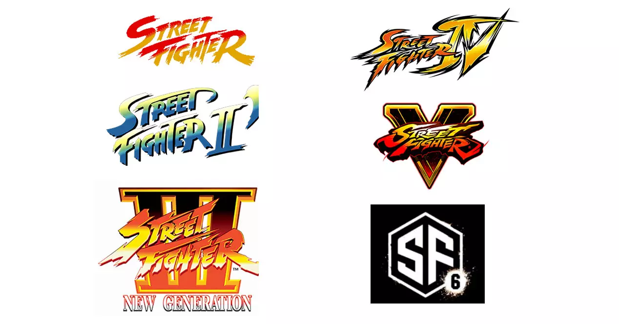
In any case, do not think that the fans were happy with that, since another of the important changes comes with the logo. Yes in previous installments Capcom did not dare to radically modify the forms evolving the old one created practically in the 80s, for this sixth part he has preferred to throw the house out the window and create a new, more compact one that saves on putting the full name of the franchise. Just a “SF6” which, by the way, also leaves behind the custom of using Roman numerals.
The controversy of the SF6 logo
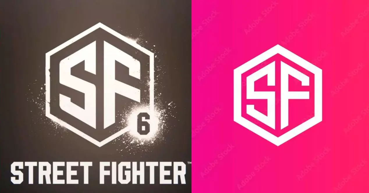
That Capcom had the right to change the logo of the game to give us the impression that a new era begins is beyond any doubt, another thing is that the simplification has led you to use one that was already (almost) designed in advance, available in an internet photography service that allows us to use an infinite image bank for any graphic resource we need.
For this new Street Fighter, the Japanese have taken one of those 80-dollar images, modified some elements of the S and F and added the famous 6 to the side, giving it an appearance that has caused rivers of electronic ink to run on networks social: that if it is the icon of a apps of mobile with 6 notifications pending to read, that if the numbering of the game looks like a chat bubble, etc. And of course, we could get this far with a franchise that not only It is the watchword of video game history. of the last 35 years, but will have the obligation to be during the next decades.
Capcom is sure that he will have received the hint from the fans and now it remains to be seen if, after the complaints, he backs down, tells us that the material announcing the 21st is not definitive and that they are simply giving mystery to the moment in which they will reveal the new logo that, yes, will already be respectful of the tradition of the street-fighter lifelong. And it is that it is what social networks have, that for good and bad, they serve as an early test to know if an artistic decision made by a company is accepted as expected. Or not.
