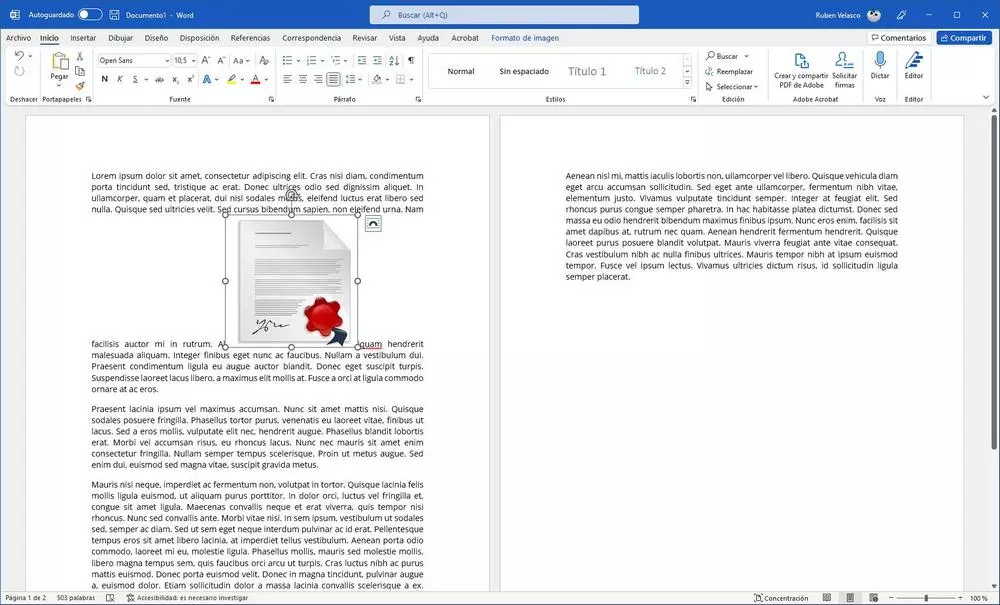
The design when we write a document is one of the most important parts. A good organization of the text, the paragraphs, and all the elements that make up the document give it a serious and professional touch. However, after having our entire document fully laid out, there is an action that almost always ends up completely unraveling it: add an image. Luckily, this is something we can fix very easily.
In general, documents are usually made up of text, divided into titles and paragraphs, and images. Ideally, as we write the document, we add the images and other elements that are part of it so that there are no problems later when adding them. But what if we have forgotten, and we have to add it at the last moment?
We can add an image to a document in various ways. If we have it at hand, it will be enough to drag it from the desktop, or a folder, inside the document so that it is inserted. If not, we can use the Insert > Images menu to manually add the image from the browser. Once added, we can see that it is placed, by default, in the middle of the text, or the paragraph, completely breaking its structure.
If we select the image, we can see that a button called “Design Options” appears. If we click on it we can see the different options of how to place the image in the document. By default, we will place it between two characters, leaving it embedded in the middle. But, below, we can find other options to adjust it to our needs. For example, we can place it inside a square (as if it were a text box), wrap it to the text, or the most interesting, the transparent option. This allows us to freely move the image around the document, wrapping the text around it so that it always fits.
Although we place the image in this way, it is very important to review the rest of the document to make sure that everything has been perfectly fitted and other parts of it have not been out of square.
Extra: respect design when opening it on other PCs
Another reason why a document can lose its design and become completely unbalanced is because we have used fonts that we do not have installed on the computer where we are opening it. Or because we are opening it with another program, like LibreOffice.
To avoid this problem, we have two options. Within the Word saving options we can find an option that allows us precisely to indicate to the program that we want, together with the document, the fonts that we have used are saved. The remaining document will occupy more, but we will avoid this problem, as long as we open it with a version of Word equal to, or superior to, the one used.
On the other hand, if we don’t have Word, or we don’t know if the other person is going to have it installed on the computer, what we can do is save it directly as a PDF. This format saves the fonts and everything related to the design of the document so that, wherever we open it, it will always have its original design.


