With every operating system, and Windows 11 is no exception at this point, Microsoft does considerable effort to reinvent the user interface of your operating system. From aesthetic details that may seem insignificant to the vast majority to complete reinventions of how to interact with the PC, design, user experience, and usability are aspects that are highly taken into account for each major revision of Windows.
These changes sometimes they are welcome by users, as happened with Windows 7 after Windows Vista, and on other occasions they cause little less than the catastrophe of Western civilizationhow we could live with the revolutionary (and I insist, as always when I talk about this operating system, advanced and misunderstood) Windows 8. What never happens is that they are indifferent, for better or worse they always give a lot to talk about.
The change in this regard between Windows 10 and Windows 11 has not been particularly pronounced, really. It is true that the centered alignment of the elements of the start bar has generated a lot of conversation (although the truth is that it is possible, simply with the system settings, to return those elements to the traditional layout), that the start menu It has undergone a good facelift and visually it is easy to distinguish one from the other, but as I said, not a change remotely as marked as many of those we have experienced in the past.
Each version of Windows is also the daughter of its time, drinks from the most current trends in the world of design (sometimes even as a precursor) and, therefore, design experts could identify the time period to which each of them belongs, even if they were not previously aware of them. And that is what makes concepts like the one we are dealing with in this news so interesting, because just like retro-futuristic science fiction, they offer us something that is both totally extemporaneous and tremendously attractive.
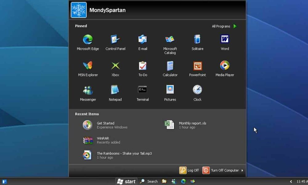
Windows Sun Valley (2001/02)
(Reup – fixed/improved some stuff.) pic.twitter.com/jC6rl1MG5n
— mondyspartan.exe (@tehmondspartan) February 17, 2023
I’m talking about some concept art from Twitter user mondyspartan.exe, who posted on this messageand that they show us What would Windows 11 look like if it was released in 2001?, more than 20 years ago. And it’s a most interesting concept, because it combines some of the most recognizable design elements of Windows XP with elements of Windows 11, such as the central alignment of the components of the start bar, and also the design of the menu ( albeit with some XP elements, like the two buttons to log out and shut down the system).
In this design concept Furthermore, applications from the past and present go hand in handWell, we can see Microsoft Edge in healthy coexistence with MSN Explorer, in addition to some of Microsoft’s great successes, such as Windows Media Player and the more than unforgettable Messenger. Now, the most unique moment of the experience comes when, reviewing the images, we find the terrifying visual style silver. It might have seemed like a good idea at the time, but in retrospect, it personally makes me want to turn off the monitor.
A few weeks ago we saw how WindowBlinds can make us recover the aesthetics of Windows 95 in Windows 11, and shortly after we found a “retro” redesign of the Windows 11 menu in the style of Windows XP. It is clear that nostalgia sellsthat anything that can take us back in time, even if only in imagination and for a little while, feeds regions of our brain that provide truly satisfying rewards.