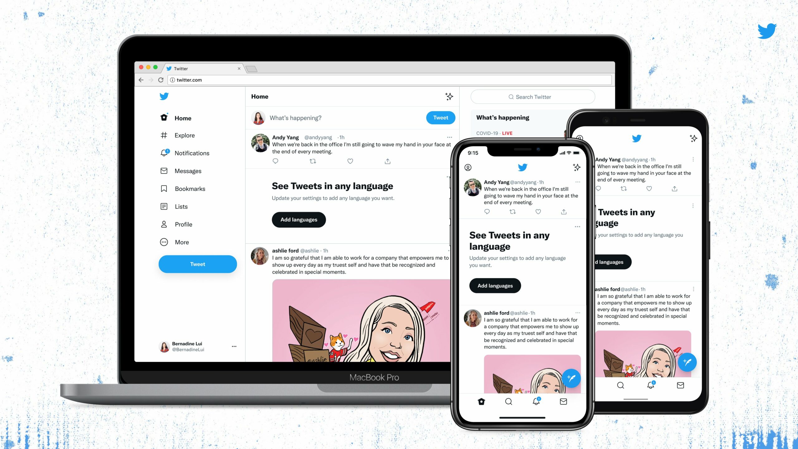
Twitter has changed its font, but also its button to follow an account.
Twitter announced in a tweet that the typeface that the social network used until then in its news visual identity created by a Parisian studio was now the official typeface for the interface. The font change began on August 11, 2021 and has gradually spread to all users. We saw the change on our accounts as of Thursday August 12, and by August 13 most Twitter users appeared to have the new interface.
The police, said to be “more fun and irreverent” must reflect both the humor and the lightness of the blue bird social network and the seriousness that can also be found there. The users will be the only ones who will be able to determine if the creative intention corresponds to reality.
In any case, some feedback reports poorer readability for people with sight problems: ” I have the impression of seeing everything in duplicate, even with my glasses “, says Lynsey Hall on Twitter. ” To me she looks a lot bigger on my smartphone », Confirms a user in response. Flaws that will pass once the eyes of these sophisticated users adjust to the changes? We must hope so.
An easter egg and a change that can lead to mistakes
The police change isn’t the only thing that happened on Twitter this August 11. The social network took the opportunity to add an easter egg, included in its new typeface. To trigger it, just type [CHIRPBIRDICON] in a tweet, all capital letters, to see the Twitter logo in the new typeface. This fun addition only works if the site already serves you the right font – a way to test whether you have it or not. The name to put in square brackets is composed of Chirp, the name of the font, Bird, the bird in English, and Icon, for icon.
Another change was spotted by TheVerge and this time could be more problematic in use: the button to follow an account or unsubscribe has completely changed design. So to speak, it’s visually reversed from what Twitter featured in its previous interface. A person you are already following no longer has a solid blue logo on their profile page, but instead a white logo with a black font that says “Follower”. Be careful: you may inadvertently and out of habit unsubscribe from accounts that you want to continue following.
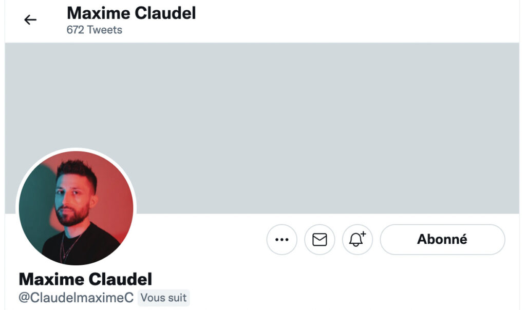
And conversely, an account that is not followed today is white on black.
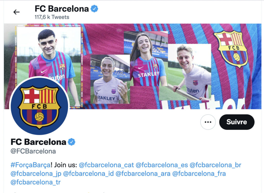
There is no more animation when hovering the mouse over an account that you want to follow: only a monitored account has a transition animation from white to red which indicates that the action will be an unsubscribe. A transition suitable for use on a computer that we will unfortunately not see on mobile.