If you want to improve the user experience of your Mac, improving the visual aspect of the interfaceIn this post we are going to teach you some tricks that will be very useful for you. Beyond configuring the Dark Mode, or the dynamic wallpapers, here we are going to show you a series of parameters that, at first, can go unnoticed.
These improvements are in the Settings
The first thing we are going to do is go to System Settings > Appearance. This section is where we can change more well-known parameters, such as activating the Dark Mode of the Mac, and that this is applied throughout the interface. However, the functions that we are going to show you below are those that are just below this one, and whose functions can be very useful, especially if we are going to work many hours in front of the computer.
If we have a wallpaper with a color palette that can make it difficult to see elements, or we want to highlight items on the desktop and applications to be able to see them instantly, we have the function Contrast colour. This option allows the elements that are selected, whatever the area, to be better distinguished thanks to the color palette. In this case, we have available the following colors to choose from:
- Blue
- Violet
- Pink
- Red
- Orange
- Yellow
- Green
- Grey
- Multicolored
As a complement to this functionality, we have available Highlight color. This allows us to highlight certain smaller and more discreet interface elements with the same color that we have established in the previous option. But, in turn, we can select this highlight color, to have a greater visual impact when it comes to perceiving the different elements that are scattered throughout the Mac interface.
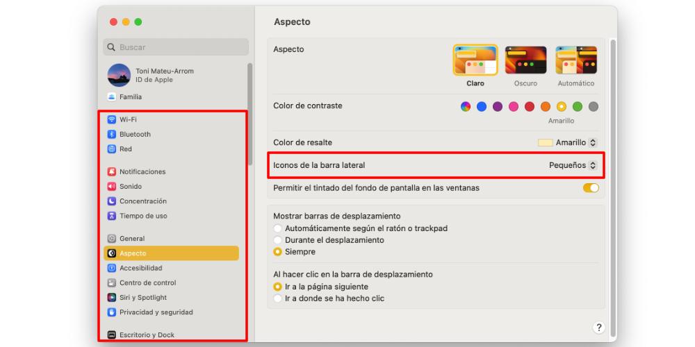
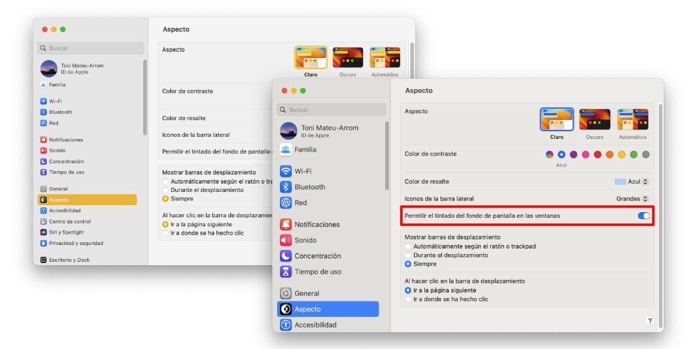
But the display of the Mac interface is not only based on colors. It is also based on the size of the text that some elements have. In this case, if we are inside an application that has side icons, as is the case with System Settings, we can select the size of the text with which we are going to see the icons. You can see the differences in size in the photos that are in this post.
The last option that we bring in this post is called Allow wallpaper tinting in windows. This option may not be noticed at first. But it can be very useful for us if we want to have the windows clearly distinguished from the wallpaper, when we have many of them open. Or, if we like to have a desktop in which the graphic elements seem like a continuation of others. Having the windows with a color tint similar to the color palette that is on the wallpaper can help us not to overload the view so much.
As you can see, these visualization tricks are options that, although they may seem subtle at first, the difference can be noticed when we are using the computer for a long time. These are, then, adjustments whose effect we are going to notice in the long term, and they will make us see that these details, however small they may be, can make a significant difference when using our Mac.